What is Regression Analysis?
Statisticians are always looking for formulas to describe relationships. But instead of using relationship formulas that we're all familiar with, such as "the rebound", "the gold-digger" and the "friends with benefits," statisticians just use... math.
The simplest type of math formula you can use to describe a relationship is just a straight line. We geeks call that a "linear relationship." (Linear = line, get it?) I bet you've heard a lot of sayings that describe a linear relationship:
"The more you put into something, the more you'll get out."
Or, alternately, "Garbage in, garbage out."
Or, the Hollywood version: "Stupid is as stupid does."
But here's what a linear relationship looks like on a graph:
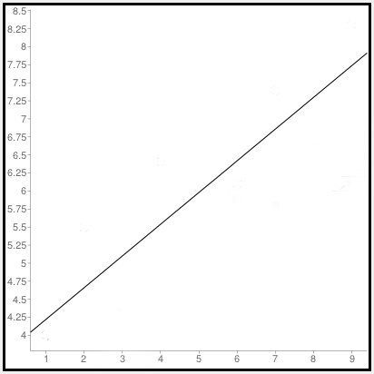
So as the value along the bottom (x) increases, the value along the side (y) gets bigger, too.
How does that line describe a relationship? Well, let's try this:
The more I work out at the gym, the more likely people at this bar are going to find me attractive.
Or, for you cynics out there:
The more I drink at this bar, the more likely I am to find these other people attractive.
Okay, you get the idea.
Generalizations such as these might be nice to know, but a statistician wants to get specific. She wants to know exactly how many more push-ups a person has to do to elicit an extra glance. Or how many beers your friend has to drink before he agrees to audition for a reality-TV dating show.
Statisticians are number geeks, remember?
More importantly, they want to test to see if the generalization is actually true. So they collect data — in other words, they go out and write down information. Maybe you track the number of dates someone gets each week after he starts a work-out program. Or you sit back and record the number of people a drunk hits on in a bar, along with the number of drinks he consumes.
Whatever you're studying, you want to collect two variables of information — an independent variable (for example: whatever thing you do first, such as weeks working out or beers consumed), and the dependent variable (the other thing that we think might result from doing the first thing, such as the number of dates you get or the number of times you got kicked out of the bar).
Once you've collected your data, it's time to plot the numbers on a graph, like this:
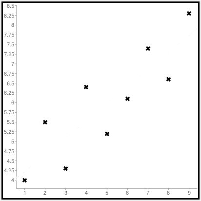
Okay, I can imagine you shaking your head. "But these points don't make a straight line!" you're thinking to yourself. Right?
Well, you are right.
Trying to connect these dots might form some weird shape, but it won't be the nice, smooth straight line that a statistician needs to describe a linear relationship. So we do the next best thing — we try to draw the line that comes as close as we can to as many of these data points as possible.
And, yep, statisticians have created a math formula to do just that. They call this formula "least squares regression."
Why that clumsy name?
Actually, the name isn't clumsy at all. It describes exactly what this equation does. A least squares regression finds the line that comes closest to the data points on the graph. Why "least squares"? Imagine you drew a square for each data point on the graph. The data point itself would be one corner of the square and the point where the square meets the line would be on another corner. The position of the line that minimizes the size of all those squares added together is the least squares regression line. (You can find an online widget to plot least-squares regression lines at <http://www.alcula.com/calculators/statistics/linear-regression>.)

Why use squares? Why not just draw a bunch of other lines, connecting the data points with the line you're trying to draw? Here's the problem with that: Some data points lie above the line, and others lie below it. If you just measured distances away from the line, you'd have positive numbers from the data points above the line, and negative numbers for the data points below the line. But you don't want those numbers to cancel each other out. You want to add the absolute values of all those numbers instead.
Rather than do that, if you just square all those distances, you get positive values for them all anyway. That's a lot simpler for mathematicians to express in an equation. Plus, using squares really penalizes lines that get too far from some of their data points, allowing you to find a line with a much more precise fit to your data.
The exact precision of that fit is measured by a result called R2 (R-squared). That number, measured between 0 and 1, tells you how much of the variation in the dependent variable is explained by the independent variable. One is a perfect fit. Zero — not so much. (The rest, figured by one minus the R2 value, is how much of the variation in the dependent variable is explained by error.)
Statisticians have a process called ANOVA (Analysis of Variance), which generates R2 and a whole bunch of numbers that can tell you whether your least squares regression line expresses a "statistically significant" relationship... or if you've just been drinking too much and your numbers don't mean a thing.
Remember, a regression analysis only tells you how well two variables are correlated with one another. But correlation does not imply causation. Here's an example: A study might find that an increase in the local birth rate was correlated with the annual migration of storks over the town. This does not mean that the storks brought the babies. Or that the babies brought the storks.
Statisticians call this sort of thing a "spurious correlation," which is a fancy term for "total coincidence."
People who want something from others often use regression studies to try to support their cause. They'll say something along the lines of "a study shows that a new police policy that we want led to a 20 percent drop in crime over a 10-year period in (some city)."
That might be true, but the drop in crime could be due to something other than that new policy. What if, say, the average age of those cities' residents increased significantly over that 10-year period? Since crime is believed to be age-dependent (meaning the more young men you have in an area, the more crime you have), the aging of the population could potentially be the cause of the drop in crime.
The policy change and the drop in crime might have been correlated. But that does not mean that one caused the other.
Read the rest of Robert Niles' Statistics Every Writer Should Know.
If these ad-free lessons helped you, would you consider sending a buck or two to Robert Niles?